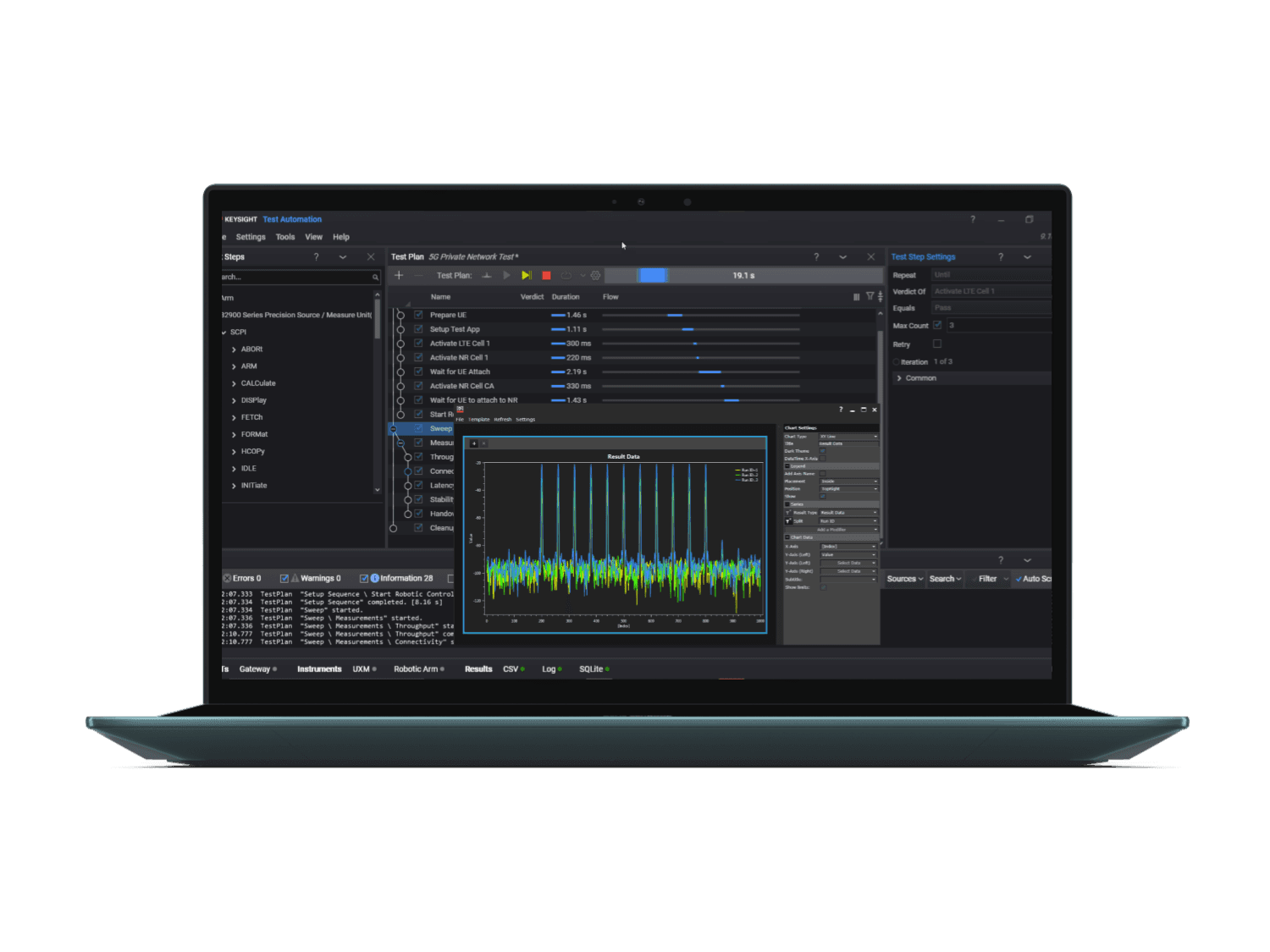
Keysight Test Automation Cloud Dashboard
ROLE: UX Researcher, UI/UX Designer
TOOLS: Figma, Figma Make, Notion, Qualtrics, After Effects
DURATION: 6 months
Keysight Test Automation Cloud Dashboard
ROLE: UX Researcher, UI/UX Designer
TOOLS: Figma, Figma Make, Notion, Qualtrics, After Effects
DURATION: 6 months
Keysight Test Automation Cloud Dashboard
ROLE: UX Researcher, UI/UX Designer
TOOLS: Figma, Figma Make, Notion, Qualtrics, After Effects
DURATION: 6 months
OVERVIEW
Keysight's PathWave Test Automation Cloud is a browser-based platform that lets test automation teams remotely control lab equipment, run tests, and analyze data from anywhere in the world. For my M.S. Capstone project, I led UX research and design alongside two teammates to build a role-aware, centralized, AI-first dashboard to help users interpret data faster, support smarter decision-making, reduce friction, and foster effective collaboration. We worked directly with industry sponsors from Keysight, spending 3 months on user research and 3 months on design.
THE CHALLENGE
THE CHALLENGE
Fragmented Workflows & Information Overload
Fragmented Workflows & Information Overload
Test automation dashboards are notoriously dense. Pass/fail rates, runtimes, coverage gaps… all critical information, but often presented in ways that make engineers and lab managers work harder instead of smarter. We were told that users of PathWave were spending more time interpreting charts than fixing problems, and some had even resorted to building their own workarounds or juggling multiple tools and methods to keep track of data.
Test automation dashboards are notoriously dense. Pass/fail rates, runtimes, coverage gaps… all critical information, but often presented in ways that make engineers and lab managers work harder instead of smarter. We were told that users of PathWave were spending more time interpreting charts than fixing problems, and some had even resorted to building their own workarounds or juggling multiple tools and methods to keep track of data.
In a high-stakes environment like test automation, a dashboard's job is to help teams act on information quickly. The existing dashboard packed in a lot of data but didn't help users sort through it efficiently. Error messages were difficult to interpret, and the signals that actually mattered were easy to miss. This made every decision slower and gave users more manual work. In test automation, where teams depend on fast and confident action to keep pipelines moving, even small delays can ripple across an entire test cycle.
In a high-stakes environment like test automation, a dashboard's job is to help teams act on information quickly. The existing dashboard packed in a lot of data but didn't help users sort through it efficiently. Error messages were difficult to interpret, and the signals that actually mattered were easy to miss. This made every decision slower and gave users more manual work. In test automation, where teams depend on fast and confident action to keep pipelines moving, even small delays can ripple across an entire test cycle.
RESEARCH METHODS
RESEARCH METHODS
Uncovering Pain Points and Opportunities
Uncovering Pain Points and Opportunities
Before talking to users, we did our homework to gather thorough context: 6 literature reviews on the product space, analysis of 12 direct and indirect competitors, and a detailed research brief with a roadmap that would keep us on track.
Before talking to users, we did our homework to gather thorough context: 6 literature reviews on the product space, analysis of 12 direct and indirect competitors, and a detailed research brief with a roadmap that would keep us on track.

Project Roadmap
After secondary research, we got to work and implemented our methodology:
7 exploratory user interviews to uncover workflows, needs, and frustrations.
4 usability tests & system usability scale surveys on the existing dashboard.
50+ survey responses to validate patterns at scale, distributed at a company event.

Snapshots From Mixed-Methods Research
We learned that users struggled with cognitive overload. They had difficulty interpreting metrics and determining appropriate actions. Workflows were inefficient, and the system offered no flexibility to adjust views based on role or context.
IDEATION
IDEATION
Key Themes & Initial Recommendations
Key Themes & Initial Recommendations
During ideation, we analyzed and synthesized the data we collected through thematic coding, affinity mapping, JTBD statements, and user journey mapping.
During ideation, we analyzed and synthesized the data we collected through thematic coding, affinity mapping, JTBD statements, and user journey mapping.

Snapshots From Ideation
We distilled our synthesis into four key themes to guide our design phase and avoid designing siloed features. With these themes in mind, we considered how features could complement each other across different workflows. This approach transformed our scattered ideas into interconnected, system-level concepts.

Key Themes & Design Recommendations
This led us to the following initial design recommendations:
Make indicators clearer, incorporate drill-downs, update in real-time.
Provide a quick, easy to digest overview with highlighted high-priority items.
Workflows should be clear and easy to follow, with minimal interruptions and clear feedback.
Incorporate features that allows users to directly control how data is presented to them.
PLATFORM SWITCH
PLATFORM SWITCH
Adapting to Change
Adapting to Change
Midway through the project, our industry sponsors informed us that they would be shifting to a different open-source technical platform. This meant taking everything we'd learned from our UXR phase and translating it to a new foundation. Rather than starting from scratch, we used our previous insights as a north star. We spent the second half of the project re-evaluating our recommendations and designing for the new platform.
Midway through the project, our industry sponsors informed us that they would be shifting to a different open-source technical platform. This meant taking everything we'd learned from our UXR phase and translating it to a new foundation. Rather than starting from scratch, we used our previous insights as a north star. We spent the second half of the project re-evaluating our recommendations and designing for the new platform.

Frameworks For Re-orientation & Ideation
We also created a structured Information Architecture map to establish a clear, organized blueprint for our designs.
We also created a structured Information Architecture map to establish a clear, organized blueprint for our designs.

Information Architecture Map
ITERATIVE DESIGN
ITERATIVE DESIGN
Usability Testing
Usability Testing
While wireframing our initial design concepts, we focused on unifying the dashboard to streamline users' workflows. We developed five features, three of which were AI-first. Incorporating AI wasn't about automation for its own sake. It was about filtering signal from noise and translating metrics into actionable decisions.
While wireframing our initial design concepts, we focused on unifying the dashboard to streamline users' workflows. We developed five features, three of which were AI-first. Incorporating AI wasn't about automation for its own sake. It was about filtering signal from noise and translating metrics into actionable decisions.

Low-Fidelity Wireframes
Our initial wireframes went through a first round of usability testing. We folded those insights into high-fidelity prototypes, then validated them in a second round: four remote sessions with engineers, lab managers, and people in adjacent roles. Ultimately, three key learnings came out of it:
Our initial wireframes went through a first round of usability testing. We folded those insights into high-fidelity prototypes, then validated them in a second round: four remote sessions with engineers, lab managers, and people in adjacent roles. Ultimately, three key learnings came out of it:
Customizability to give users more control → Users preferred being given the option to do tasks manually instead of fully relying on AI features to complete them, and have the capability to manipulate and modify their views.
So, we provided space for the user to complete their tasks, having AI features provide users flexibility and play an assisting role rather than do everything for them.
Traceability to validate information → Users wanted a way to trace and validate information given to them by AI-driven features as a way to build trust in the feature's capabilities.
So, we consolidated AI-driven insights in a dedicated section and provided direct methods to validate it.
Context to build understandability → Users desired more context about a feature's capabilities so they both understand what the feature does and how it can help them achieve their task. Users also want more ways to modify content to achieve a desired content and information depth.
So, we improved descriptions of features and added tooltips. We included features that help users to improve content.
FINAL DESIGNS
FINAL DESIGNS
What We Built
What We Built
AI-Assisted Dashboard Creation: Users can either manually add charts or describe their goals in natural language in an AI prompt box. The AI delivers chart suggestions based on the user's input and the dataset they selected or uploaded.
AI-Assisted Dashboard Creation: Users can either manually add charts or describe their goals in natural language in an AI prompt box. The AI delivers chart suggestions based on the user's input and the dataset they selected or uploaded.


Drill-downs, AI Summaries, and AI Reports: An AI Summary panel provides insights across the dashboard. These insights come with pointers that guide users to the data and charts related to it. These pointers act as a guide for users during drill-downs. In the drill-down view, the AI Summary panel also provides in-depth insights about the chart itself. AI Reports helps users compile dashboard activity into precise, insightful reports. Users can control for the level of detail and what content to include on the report during creation. After, users can edit and modify the report and add insights from the AI Summary panel. The report can be shared, exported, or saved as a template for future use.
Drill-downs, AI Summaries, and AI Reports: An AI Summary panel provides insights across the dashboard. These insights come with pointers that guide users to the data and charts related to it. These pointers act as a guide for users during drill-downs. In the drill-down view, the AI Summary panel also provides in-depth insights about the chart itself. AI Reports helps users compile dashboard activity into precise, insightful reports. Users can control for the level of detail and what content to include on the report during creation. After, users can edit and modify the report and add insights from the AI Summary panel. The report can be shared, exported, or saved as a template for future use.

Personalized Alerts: Users can add alerts to catch threshold spikes and anomalies, providing visibility before they escalate. Alerts can be accessed on the dashboard with a link to the related data.
Personalized Alerts: Users can add alerts to catch threshold spikes and anomalies, providing visibility before they escalate. Alerts can be accessed on the dashboard with a link to the related data.

Version History: A log of dashboard changes so teams can track what was modified, when, and by whom. They can also easily and quickly restore a previously saved version of a dashboard without having to rebuild it.
Version History: A log of dashboard changes so teams can track what was modified, when, and by whom. They can also easily and quickly restore a previously saved version of a dashboard without having to rebuild it.

CONCLUSION
CONCLUSION
Impact & Future Work
Impact & Future Work
Ultimately, our research insights and design recommendations helped reframe how Keysight thought about AI in workplace tools: not as a replacement for expertise, but as a way to make workflows faster, more tailored, and more efficient while keeping humans in control.
Ultimately, our research insights and design recommendations helped reframe how Keysight thought about AI in workplace tools: not as a replacement for expertise, but as a way to make workflows faster, more tailored, and more efficient while keeping humans in control.
There were two things holding the prototype back. First, we used mock data instead of real data. Second, the AI was layered on top of the existing workflow rather than being built into it from the ground up. As a result, users couldn't fully trust the AI's suggestions and had to manually review each one. This canceled out a lot of the time savings the tool was supposed to provide. Connecting the AI directly into live systems, training it on actual datasets, and surfacing the reasoning behind its decisions to users would close that gap in future versions.
There were two things holding the prototype back. First, we used mock data instead of real data. Second, the AI was layered on top of the existing workflow rather than being built into it from the ground up. As a result, users couldn't fully trust the AI's suggestions and had to manually review each one. This canceled out a lot of the time savings the tool was supposed to provide. Connecting the AI directly into live systems, training it on actual datasets, and surfacing the reasoning behind its decisions to users would close that gap in future versions.

Snapshot From Our Project Presentation